Over the past year, we have been reflecting a lot on co-constructed alphabets and number lines. Cheryl and I have had rich conversations about their benefits, how they are approached, how they are used, and what their purpose is in a classroom.
All over social media, you will see absolutely stunning alphabets, number lines and representations created by and with children. I am always impressed with the beauty, passion and detail that goes into their creation.
With all that being said, our wondering lies in the purpose and intention of displaying a co-constructed alphabet in the classroom for an extended period of time.
Questions that come to mind…
What is the purpose or intention of having it displayed? Is it art…or is it a tool for learning? Is it truly art, if we are inviting children to make a specific letter?Does it become wallpaper?How do children engage with it?Is it at eye level?Is it interactive?Does it stay up the following year?What is students aren’t interested in contributing, is it then meaningful for them?How does it support students in understanding about letters and/or numbers?We have talked through all of these questions and I think that they are helpful in supporting educators in reflecting on their intentions.
Conversations on Twitter and with colleagues brought up other important factors too:
Tessa Heffernan mentioned that perhaps it could be thought of as a different type of font and reflected that perhaps there are many forms of the alphabet in the classroom.
Laurel Fynes added in that it is important to reflect on what children use and look at in the classroom (beyond just the alphabet, thinking of documentation and other things on our walls – what do they return to? what do they ignore? what do they share with others/visitors/new students?)
Are we posting something in the classroom as a tool to support student learning? If so, should the letters not be properly formed and clear/concise for the children to see?
I think about a young child who is curious and learning about letters. When looking at a co-constructed alphabet the letter may not be clear and easy to decipher for a child who does not have clear concepts of certain letters/numbers.
Contrarily, I don’t know that shopping at a teacher resource store and buying a “pre-made” commercialized alphabet is the solution. Often times, these commercial alphabets are extremely overstimulating in terms of colour and images.
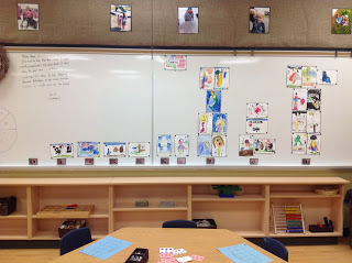
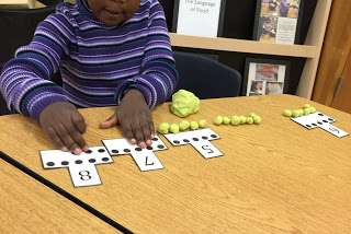
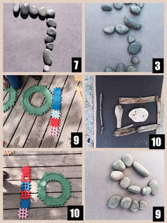
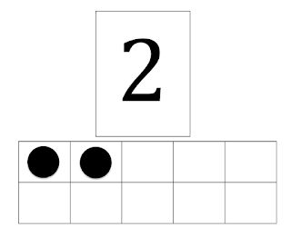
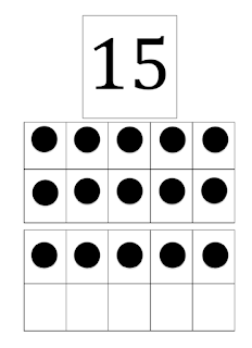
Our number line was created from play dough and photographed by children. They later illustrated and used water colours to create pictures to make a song that we wrote with musician Catherine Wheatley about numbers.
Slow down and reflect…
What is your intention or purpose?
Ultimately, we are always thinking about our intentions or purpose behind things that are happening in our rooms. If our intention is to support children in developing their understanding of the alphabet – is a co-constructed alphabet the more supportive way to do so?
If our intention is to provide a tool for children to use when engaging in reading or writing in play, does the co-constructed alphabet help?
Accessibility is Important:
For us, we wanted the children to have access to an alphabet and number line that was practical, helpful, and accessible.
Further to that, many classrooms have the alphabet or number line posted so high that it is not within eye sight of the children and much more challenging for them to interact with.
Could we invite or follow children’s interests when finding or making a co-constructed alphabet, while still sharing a form that is practical and used as a tool?
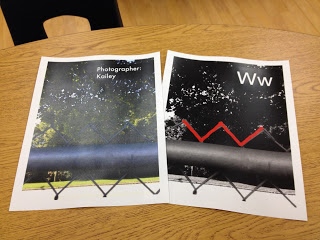
We decided that instead of putting the co-created alphabet up on the wall, we would create a binder with the creations in it and share it in our book nook. Last year, students were inspired after reading City ABC to photograph representations of letters in the outdoor environment. Instead of posting, we added the photographs into a binder for children to access when interested.
What is up in our room now?
After deciding that we wanted children to have access to an alphabet and number line that had properly formed letters and numerals, we began to reflect on what that might look like in our classroom.
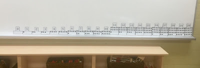
Based on the children’s interactions with both lines this year, we have found that the children are engaging with them more and making stronger connections to letters/sounds/numbers in play.
While we value the connection that children have to creating and being a part of the process we wondered if there was a way to ensure that it was still a valuable learning tool while inviting children to be a part of the process.
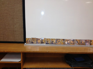
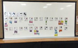
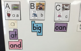
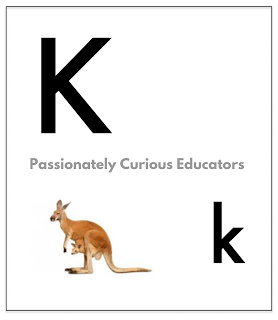
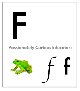
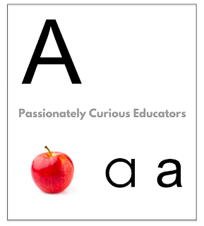
We have created letters this year and we added a small picture in one corner from the letter cards that we have in the room as a student tool. We have left space for students to add a picture that is meaningful to our classroom (e.g., a picture of flowers in our front play area on the letter “F” or a picture of a child whose name starts with that letter specifically).
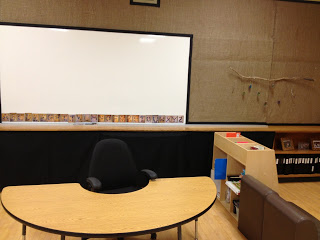
Our alphabet has the capital, lower case, and sometimes another form of the letter (e.g., different ways you can write the lower case a). The letters are magnetic and children can reach them to take them on and off the whiteboard.
